After many projects, my point of view on text visualization is that the most effective ones are fine-grained: bringing individual words
and phrases to the fore, rather than aggregating at a high level.
A good example is the word tree. This visual search technique lets you pick a word or phrase and charts all the different
contexts in which it appears. The contexts are arranged in a tree-like branching
structure to reveal recurrent themes and phrases.
The image above is a word tree made from Martin Luther King's famous "I have a dream" speech, using the search term "I." Font sizes show frequency of use, so you can see that among King's many uses of "I," the most frequent context is the phrase "I have a dream."
The Word Tree was introduced on the Many Eyes site, and described in detail in
The Word Tree: An Interactive Visual Concordance. Although
Many Eyes no longer operates, you can play with this technique in Jason Davies's wonderful implementation.

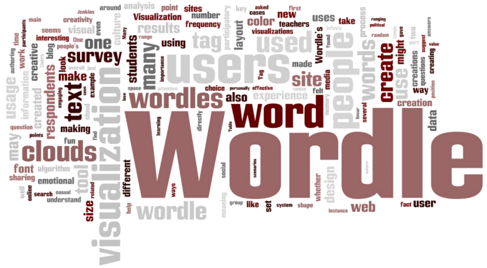
I've also studied popular usage of chart types such as tag clouds or "wordles." While
problematic by some conventional visualization norms, many people love them—for reasons
that are subtle and surprising. The image above is from the original Wordle site, created
by Jonathan Feinberg. Jonathan, Fernanda Viégas, and I did a study (Participatory Visualization with Wordle)
which uncovered a range of non-analytical usage for this technique.
A primary result was that many users saw Wordles as a means of creative self-expression.
Fernanda Viégas and I analyzed other types of tag clouds, which almost can be viewed a sort of "folk art." See Tag Clouds and the Case for Vernacular Visualization. At the same time, we've looked at ways to harness the advantages of
tag clouds for analytical purposes, as in our work with Chris Collins: Parallel Tag Clouds to Explore and Analyze Faceted Text Corpora.

Phrase Nets use a simple form of pattern matching to provide multiple views of the concepts
contained a book, speech, or poem. The image above is a word graph made from Jane Austen's novel
"Pride and Prejudice." The program has drawn a network of words, where two words are connected if they appear together in a phrase of the form "X and Y".
This extremely simple algorithm produces natural clusters.
Read more at Mapping Text with Phrase Nets.

The strangest text visualization technique I've worked on may be the Chromogram, which visualizes long sequences of text by mapping words to colors.
Arbitrary as this approach may sound, it's surprisingly good at revealing patterns in real-world data. In 2006, working with Kate Hollenbach, we used this technique to study the editing activity of Wikipedians. See Visualizing Activity on Wikipedia with Chromograms.
|


